
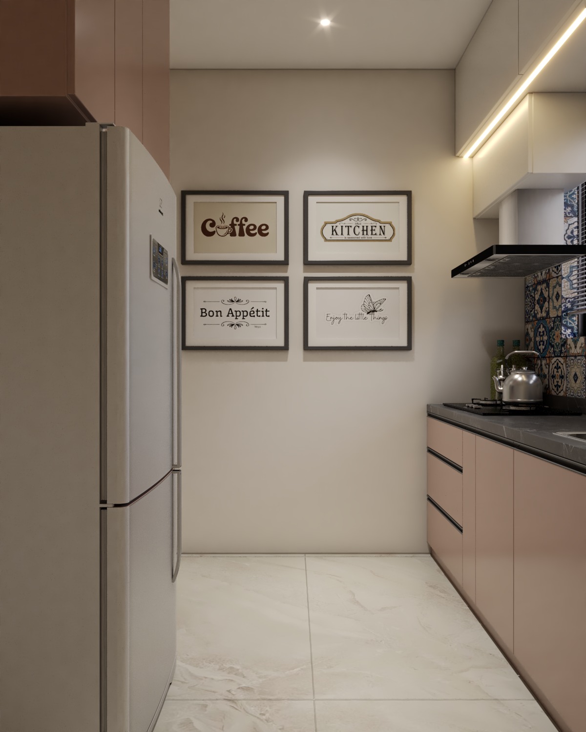
Kitchen Colour Combination Ideas for a Modular Kitchen That Feels Right
As you step into a kitchen showroom, you might find your thoughts racing. Should the cabinets be a timeless white or a bold color? Will that green be sophisticated or too overpowering when it covers a full wall? Choosing a color palette for your kitchen is one of the most thrilling elements of designing a modular kitchen, yet it frequently leaves homeowners questioning their choices.
The challenge is significant. Unlike a bedroom where you can easily change a cushion cover to update the style, a kitchen renovation is more complex. Modular kitchens consist of laminates, shutters, countertops, backsplashes, and flooring, all of which can be costly to replace later on. A color combination that appears appealing on a sample board might end up looking dull, cramped, or chaotic once installed in your actual lighting.
The great thing is that you don’t have to be a design expert to achieve this. By following a few straightforward principles, having a solid grasp of your space, choosing the right materials, and using some proven combinations, you can create a kitchen that not only looks stylish now but also remains appealing for years to come. Let’s explore how to do this.
Why Your Kitchen Colour Combination Matters More Than You Think
Color plays a significant role beyond mere decoration. It can alter the perception of space in your kitchen, enhance brightness, and even impact your mood while you prepare meals.
Lighter colors tend to reflect more light, making smaller kitchens appear more spacious. On the other hand, darker shades can introduce depth and drama, but they may also create a sense of confinement in a small area. Warm colors like cream, beige, and soft yellow contribute to a welcoming and homely vibe, while cool colors such as grey, blue, and green promote a calm and tidy environment.
With the various surfaces in a modular kitchen, it’s important to choose the right kitchen colour combination to make sure everything appears thoughtfully designed instead of random.
Start With the Basics: The 60-30-10 Rule
To achieve a balanced color scheme, designers often follow a simple guideline.
60% dominant color: This is generally found in base cabinets, upper shutters, or walls, setting the mood for the space.
30% secondary color: This could be the contrasting lower cabinets, a feature wall, or the island.
10% accent color: Think about items like handles, backsplash tiles, pendant lights, or small decor pieces.
Using this ratio helps ensure the kitchen doesn’t feel too flat or cluttered, making choices easier.
Popular Kitchen Colour Combination Ideas to Consider
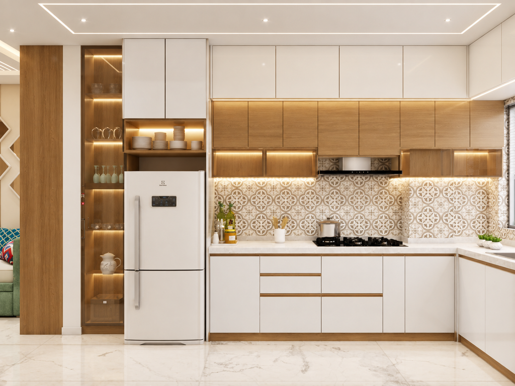
White and Wood
The combination of white upper cabinets and wooden-finish lower cabinets is truly timeless. This pairing not only adds brightness but also warmth to any kitchen. It fits well in kitchens of all sizes and complements both modern and traditional styles.
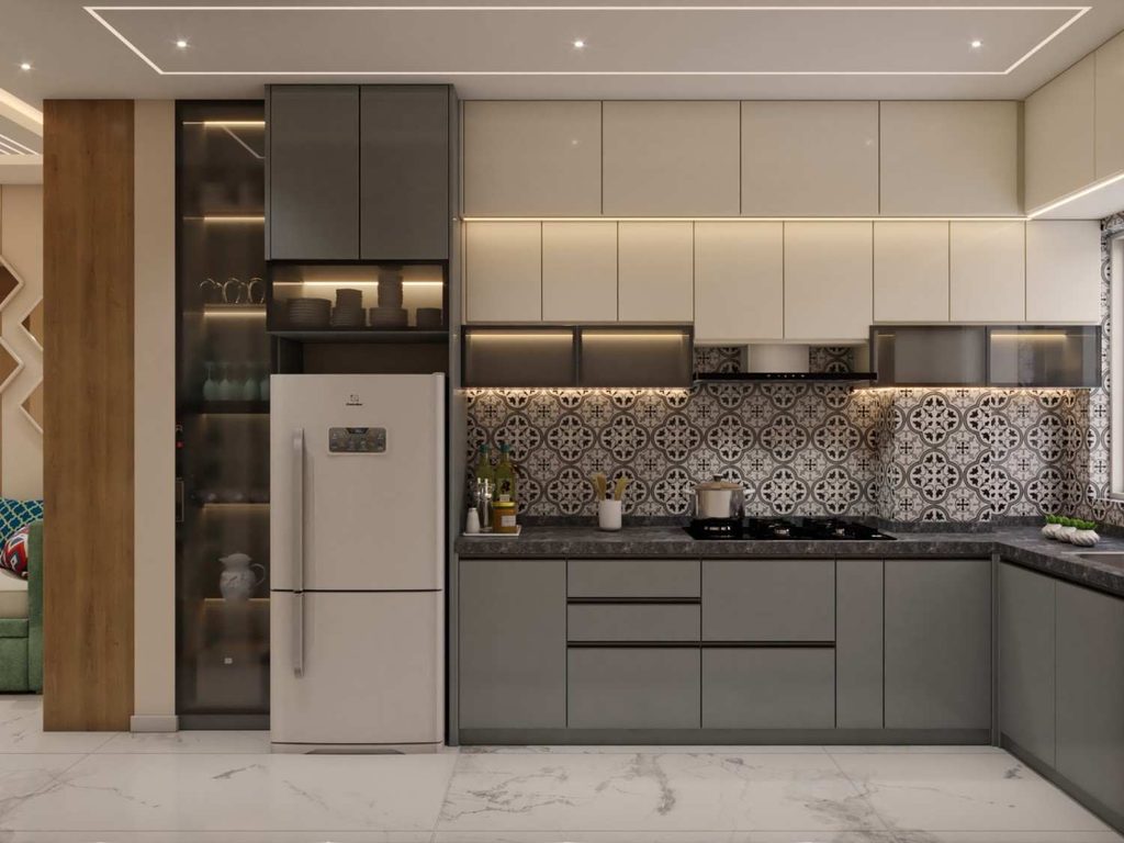
Grey and White
A peaceful and stylish choice. Light grey shutters alongside white countertops or a backsplash create a fresh and sophisticated vibe. You can enhance the look with brass or black handles for a subtle flair.

Navy Blue and Cream
If you’re looking for an elegant touch without being overly bold, consider navy lower cabinets combined with cream upper units. This combination exudes sophistication, particularly in medium to large kitchens that benefit from ample natural light.
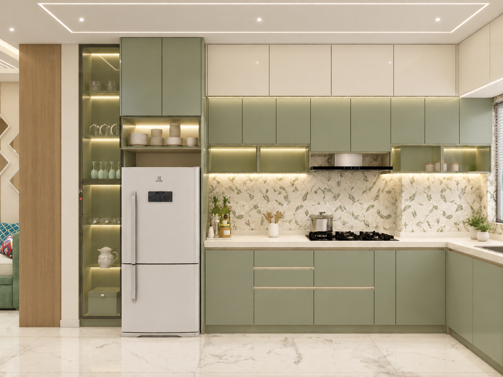
Sage Green and White
Soft green shades are gaining popularity as they evoke a sense of freshness and a connection to nature. When combined with white or light wood, sage green creates a calming, spa-like atmosphere in the kitchen.
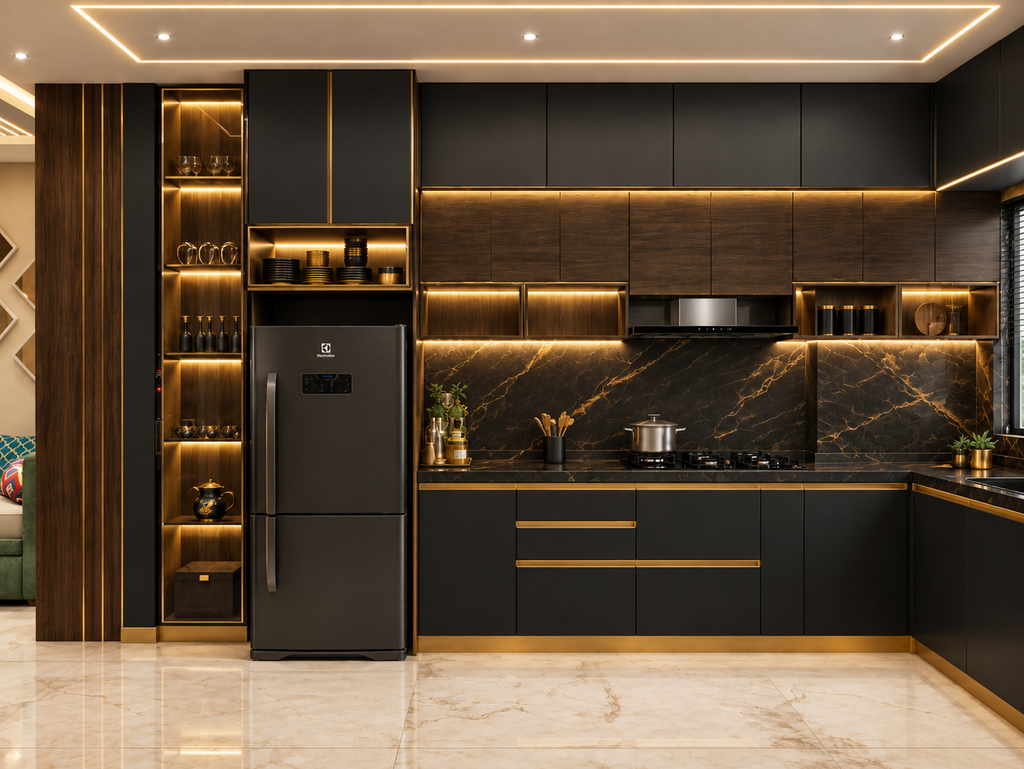
Black and Gold or Wood
To achieve a modern and luxurious appearance, matte black cabinets with warm gold or wooden accents are an excellent choice. This combination shines in well-lit kitchens, or you can ensure a balanced look with plenty of lighting.

Beige and Brown
This combination has an earthy and comforting vibe, making it perfect for families who enjoy a cozy, classic atmosphere. Plus, it does a better job of concealing everyday stains compared to pure white.
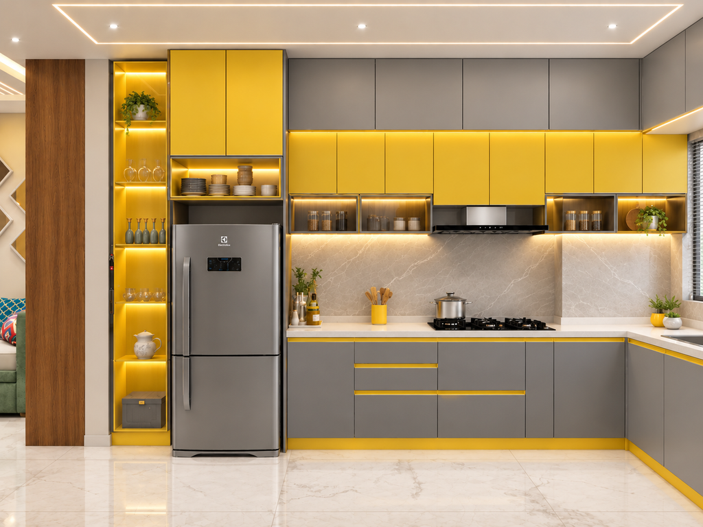
Yellow and Grey
A vibrant and joyful blend. Use yellow in moderation, perhaps for lower cabinets or as accent pieces, and let grey serve as the grounding element in the design.
Best Materials for a Modular Kitchen
A stunning color scheme will only endure if the materials beneath it can withstand heat, moisture, grease, and everyday wear. Consider materials in two layers: the core that provides strength to your cabinets and the finish that adds color.
Cabinet Core Materials
Marine or BWP plywood: Modular kitchens often benefit from materials that perform well in humid climates. This type of material is great at resisting moisture and securely holding screws, which is essential for supporting heavy storage units. While it may be pricier, its durability makes it a worthwhile investment.
HDHMR (high-density high-moisture-resistant board): A well-liked contemporary option, it is thick, sleek, and resistant to water. It absorbs color finishes uniformly and is often less expensive than plywood.
MDF: This material is smooth and can be easily shaped, making it a good choice for grooved or curved shutters. It’s more appropriate for dry areas, so it’s best to avoid using it near the sink.
Particle board: This budget option is effective for upper cabinets in dry kitchens, but it can swell when exposed to moisture, which makes it unsuitable for base units.
Stainless steel: This product is entirely waterproof, termite-proof, and easy to maintain. It caters to those who prioritize durability and an industrial design, but the range of colors is a bit limited.
Shutter Finishes (Where Colour Comes In)
Laminate: This option is not only affordable and durable but also available in countless colors, textures, and wood grains, making it the ideal choice for many homes.
Acrylic: Offering a glossy, mirror-like finish, this option can make small kitchens feel more open and bright. However, it does attract fingerprints, so you’ll need to clean it often.
PU (polyurethane) paint: This product offers a smooth, top-notch finish in almost any color imaginable. It’s especially good for custom shades like sage green or navy, but it tends to be on the pricier side.
Membrane or vinyl wrap: This product is excellent for shutters that have grooves or profiles, and it is available in a variety of colors. Be sure to keep it away from the stove, as heat can lead to peeling.
Veneer: Real wood layers provide a natural and warm aesthetic. While they are stunning, they do require a bit more maintenance.
Countertop Materials
- Granite is known for its strength, heat resistance, and affordability, featuring beautiful natural patterns.
- Quartz, on the other hand, is non-porous, stain-resistant, and requires minimal maintenance, available in consistent colors that complement modern designs.
- Solid surfaces like Corian offer a seamless look and are easy to repair, although they are not as heat-resistant.
- Marble brings an elegant touch but is porous, making it susceptible to stains from substances like oil, lemon, and turmeric. It’s ideal for those who appreciate a bit of patina over time.
- For backsplashes and flooring, glazed ceramic or glass tiles are easy to wipe down and come in a variety of colors.
How Material Affects Colour:
The same color can appear quite different depending on the material. For instance, a glossy acrylic navy tends to look deeper and more reflective compared to a matte laminate navy. Additionally, a PU finish offers a richer and more uniform tone than a vinyl wrap. It’s important to always check your selected color on the actual material rather than relying solely on a paint swatch.
Choosing Colours Based on Your Kitchen Size
Small Kitchens
Select light colors such as white, cream, pastel green, or light grey. Incorporate a single accent color and ensure surfaces are glossy or semi-gloss to enhance light reflection. Avoid pairing dark tones on both the upper and lower cabinets at the same time.
Medium Kitchens
Feel free to experiment with colors. A two-tone design, where the upper walls are light and the lower ones are darker, can introduce depth to the space without it feeling cluttered.
Large Kitchens
Bright colors, contrasting islands, and darker hues work well because the space can manage them. A colored island alongside neutral cabinets is a popular technique for making a focal point.
Think About Lighting and Direction
The way colors appear can be greatly influenced by natural light. A kitchen that faces north typically gets cooler, softer light, so using warm tones like cream, beige, or soft yellow can help create a nice balance. On the other hand, kitchens facing south or west receive stronger, warmer light, making cooler shades such as grey, blue, or green feel more refreshing. Always remember to check color samples at different times of the day and under your kitchen’s artificial lighting before settling on a choice.
Don’t Forget Countertops, Backsplash and Flooring
Cabinet color is just one element of your kitchen’s design. Your countertop, backsplash, and flooring should enhance the look rather than clash with it. For bold or patterned cabinets, choose a simpler countertop and backsplash.
If your cabinets are neutral, you can add interest with a textured or patterned backsplash. Mid-tone greys, beiges, or wood finishes for flooring generally work well with most designs.
Practical Tips Before You Finalise
- Limit your color choices: Focus on two or three primary colors along with a neutral shade.
- Mix finishes, not just colors: Combining matte and glossy surfaces can add depth, even in a straightforward design.
- Think about upkeep: Very light and very dark glossy surfaces tend to show stains and fingerprints more prominently. Mid-tones and matte finishes are generally easier to maintain.
- Match materials to their location: Use moisture-resistant materials near the sink and heat-resistant finishes near the stove.
- Consider the future: Design trends change frequently. A neutral foundation with a changeable accent, like handles or tiles, allows for flexibility.
- Test before making a decision: Request physical laminate samples and see how they look in your own kitchen.
Common Mistakes to Avoid
One of the most common mistakes is using too many colors, which can create a cluttered feel in the kitchen. Other issues include overlooking lighting, striving for perfect matches that lead to a flat look, choosing materials based only on their appearance, and following trends that don’t fit your lifestyle. Remember, a kitchen is a functional area. While beauty is important, practicality should always be a key consideration.
Conclusion
Choosing the right kitchen colour combination is essential for achieving a balance of beauty, functionality, and personal style. Start by applying the 60-30-10 rule, ensuring your color palette complements the size and lighting of your kitchen. It’s important to maintain harmony among your countertops, backsplash, and flooring with your cabinets.
Classic combinations such as white with wood, grey paired with white, or sage green alongside cream are great starting points. If your space permits, consider bolder colors like navy or black to inject some character. For those planning a modular kitchen and seeking more inspiration, check out our additional guides on layouts, materials, and storage solutions.